the poster


this is my poster of my third assignment of this trimester

the process.

Now is the time to show I work on my poster is adobe illustrator..

first i show the grid and the ruler so that i can draw my things appropriately.then I use the gradient to colour the background of my poster using the colour of orange to yellow then to white to show the sun shines and the sky....i name this layer as the sky....

after doing that,I use ellipse tool to draw the sun shine path,I select the part where I want them to be light and adjust the opacity of the colour of the parts so as to show the sun shines brightly from the centre.


After that,I create a new layer named perspective path and I draw a circle at the centre as the sun and I uncoloured the outline of it so that it is more natural.then I draw a horizontal line at the centre to show where the land is and also the sky,I pick the colour of dark brown as the land.


then under the same layer,i draw another path to show the walk way and i choose the texture of mmosaic tiles to show t
he roughness of the floor. I choose the colour of light brown for the land to show the light source and also to differentiate the walk way and the ground.


next is the trees along the pathway..I first place the tree from the assignment 2 to assignment 3,then I duplicate it and transform it to smaller trees to show the distance perspective.then i group it one by one.

this is what it looks like


after that, I draw a few lines on the walkway as the shadow of the trees using brushes(charcoal pencil-rough)as like the picture on top.


Finally, is the wording...I first use the type tool and I type the words:"green for living &future".Then I size of every words to make it a little different but yet simple..i choose the font under the name called century gothic-regular for the word green.


for the other words:for living &future,I use the font of stencil std bold and i change the

colour to blue and the outline of the word"for" to orange...


this is the final outcome....

sketches

After searching pictures,I start to draw my idea out and edit a little bit through the references I have found..
The first picture is using my subject(tree)and duplicate it according to distance to show the perspective of the land with trees and the warm sky that shows shinny, fresh day....more attractive though as it also shows the future of the earth as more trees are planted around us....cool.

I did not need to do much sketch this time as my first sketch was approved by my tutorial and so i just use it. It also save a lot of time.

Assignment 3-research

Hello....here comes the assignment 3 which is making a poster of your area using your subject illustrated in assignment 2.This is the task i have to complete for assignment 3

So, as usual,i need to search for pictures of posters in order to do my assignment.These are the pictures I found,not much but is enough as I have my idea earlier...


I like the word font of the posters.Is simple, easy to read and attractive...

Final !!!!!!!


Final output of assignment 2!!!!!


The process

First, as usual I took a picture of my sketch and then I print screen to paste it in paint and save it,import it to illustrator.


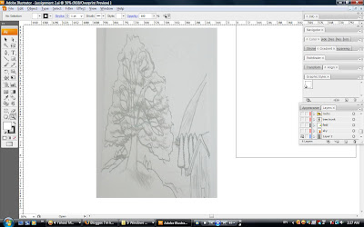
Then I make this layer as a template,then i show ruler as well as grid to help me in giving a more appropriate drawing.
After that,I make another layer called the tree trunk


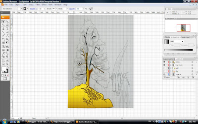
and then the rocks which is the bottom part of the picture.how do I draw the trunk and those sticks? under brushes,I choose artistic( artistic charcoal pencil) with the stroke of 1pt and the thickness that I like.and I put gradient of dark brown to light brown for the trunk that I have selected to show the light source.

The other layer-rocks,simple,I use the same brush tool,same gradient colour and I draw the outline.And the on top is what it becomes...After that, I draw a few lines with the same brush tool on this layer,meaning on the rocks to show the rough surface of rocks.


Next,another layer named leaves.In this layer, I make another sub-layer called the dark green.Using the brush tool with the Artistic charcoal pencil that I have chosen for the trunk and rocks,I then select the dark green colour that I would like to use to draw the leaves.


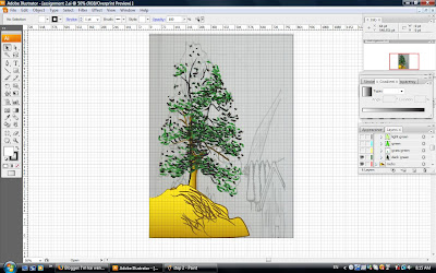
this is what it looks like.

Then another sub-layer-the grass green, using the same brush of the same type(artistic charcoal pencil).Lighter green is used this time.


another sublayer again-green.Same technique...


another sublayer again-light green


Next,another sublayer as well-highlight.using a light yellow and white to show the toning of the leaves and also the light source.

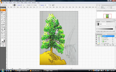
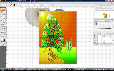
This is the final out look of the tree.

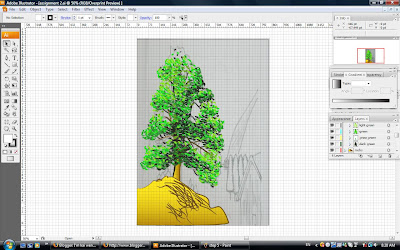
Next, I make another layer called the sky where I used the gradient with the toning of orange to yellow and to white as the sunlight.This is also the background of the picture.


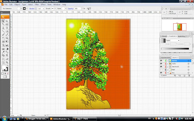
After that, I use the flare tool
to draw the effect of sunshine....looks better this time.


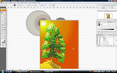
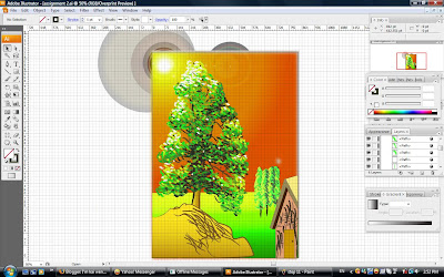
Then, make another layer named field as the ground of the scenery.


I draw a line and I use gradient of the toning of colour of green to yellow as the field of grasses.
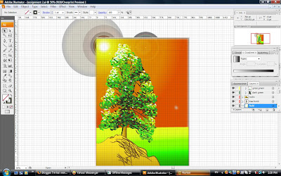
then, I use brushes of the type called artistic charcoal pencil to draw trees behind and at further distance from near.


Next is drawing the house using pen tool and apply colour from the colour guide.


After that, I draw the rocks like mountain behind the trees and the house using pen tool. choose the colour of orange and make a toning to yellow colour and make a texture of canvas to show the rough surface of the mountain.I choose that under effect and the light source is from top.


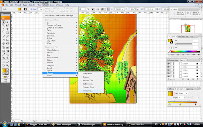
The toning is the reflection of the sunlight when sun sets.same goes to the other mountain behind it. Is just the colour of toning is yellow to white using gradient


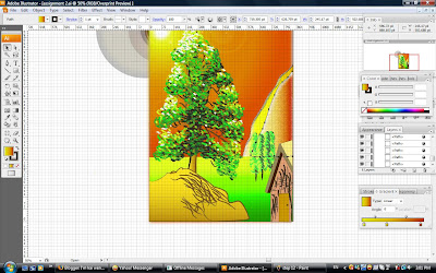
this is the final picture of my assignment 2.


sketch 2

Using the tree I have drawn, I can now illustrate the background of my picture.And these are what I have come out with:


but I still don't know how can I make it more interesting....So I searched for more pictures as a reference on how can I improve my picture to be better


After getting more references,i could now have some idea on how I want to do for my picture.I will take the idea of sunshine and a warm sunset colour,like the second and third picture.

Sketches

From those pictures that I have found, I could now have some idea of what kind of tree I would like to draw for this time. Below are the sketches I have drawn.


Since the task for this is to illustrate our object as realistic as possible,I have chosen the best tree I have drawn on top to be my final tree of my picture for this task:


Hmm, kind of challenging this time...

Assignment 2-research

Hello,here I am and now is time to begin assignment 2. This task is to illustrate the area you have chosen for global warming. As my area is about plantation,so is dealling with the nature and flora.So, in this case I will illustrate a tree, as what the others who do deforestation. Similar topic I would say.

Obviously without any reference or examples of pictures cannot help me to get any idea of the topic. So,I went online and I found these interesting pictures of trees.Unique with beautiful background. Have a look at them.


The Symbol !!!


Creating a symbol without explaining each and every part of what have been done, then the symbol becomes meaningless.So, let me explain from A to Z about the symbol I have created.


THE LEAVES( IN HEART SHAPE)- plantation

The hearts drawn on top of the hand represents the leaves of plants.Reason why I draw it in heart shape is because the heart shows the meaning of LOVE and CARE, so I modify the leaves in actual shape into the shape of heart simply due to this reason. Meanning that we love our earth by planting more plants arround us.That is also why those hearts(the leaves) were coloured in green as green in the real colour of leaves.


THE TINY HEARTS- growth

The tiny hearts inside the big hearts are actually showing the meaning of NEW GROWTH and continuous growth of plants without cutting it down.This is also why they were coloured in
yellow as yellow stands for new birth and fresh appearance and long lasting.


THE LEAVES(MIDDLE WITH STEM)-cooling

The tiny leaves in the middle of the hearts show the act of planting more trees. The colour blue shows the meaning as cooling down the earth as blue gives us COOL feeling. So, conclusion of this part is: cool the temperature of the earth by planting more trees.It is the same theory for the outline in purple as purple shows calm and cool in a way.


THE HAND-be energetic to plantation

The hand shows the motivation of plantation.It actually telling the message to the people to plant more trees to cool our atmosphere as a way to save the earth as well as ourselves.It was coloured in red with toning telling them to love planting just like the fire, be ENERGETIC to plant trees.


THE LOWER PART OF LEAVES-stability


The lower part of the leaves were drawn in at the bottom showing growing plants in long term without cutting it down unnecessarily . In other words, plant more trees and keep planting trees to achieve stability in plantation and also temperature change. Just like the message I said in previous post: colour the earth with GREEN.

The process

First,I took the photo of the symbol and put it in adobe illustrator by web cam and paste it in paint. From there,I copied it in illustrator..


Then, I make that layer as the template.Then,I show the ruler and the grid to draw a more accurate symbol.
After that, I make a new layer called the leaf(leaf with the shape of hearts)and then started tracing it using pen tool.


I use the free transform tool to copy the shape of the heart to the other sides of hearts.This can save the time and also can give more accurate shapes of all sides.

After that, I make another layer and named it as hand as i m going to trace the shape of hand.


After tracing that,I make another layer again to trace the bottom part that is the symbol that shaped like leaf as well. I named this layer as leaf-lower part.


Finally I have traced finished the symbol.The next step is colour the symbol. First, I select the layer of the leaf and then I choose the colour i want and put it in the gradient bar.Then apply it to the part I want.

the beginning


the final.

After that I apply the inner hearts with the colour of yellow...


then the small leaf in the middle and the stem, I coloured it blue with gradient.


Next, the outline and the hand....


the bottom leaf...


the final product...


completed!!!!